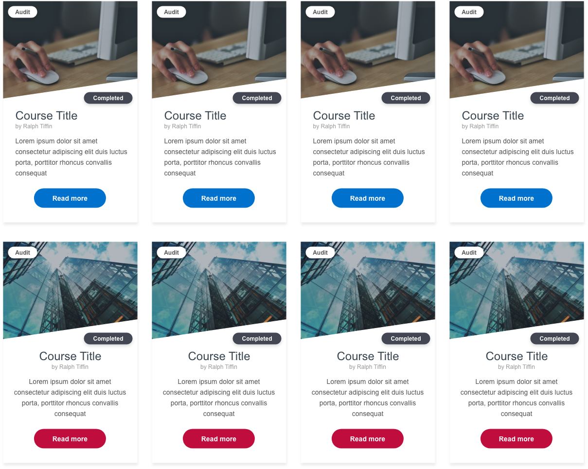
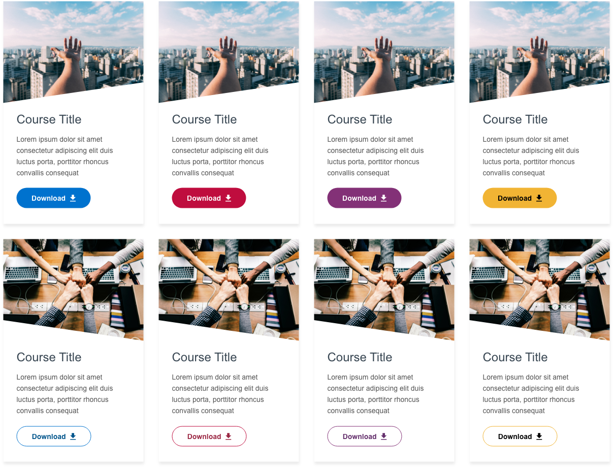
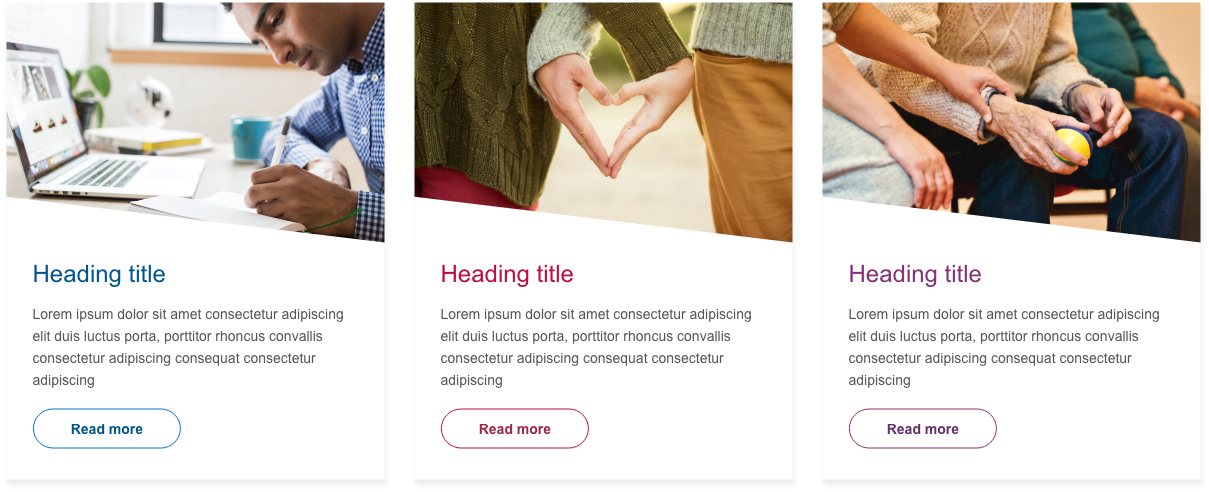
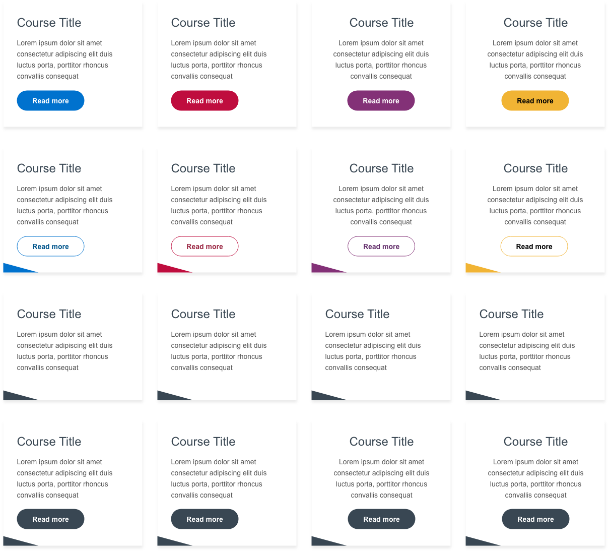
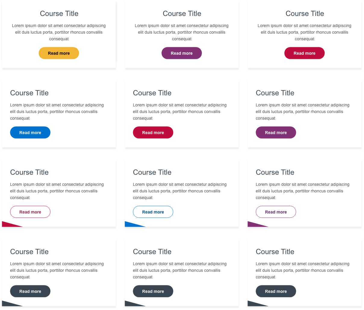
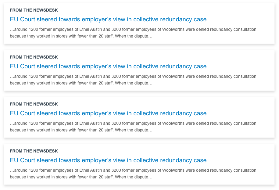
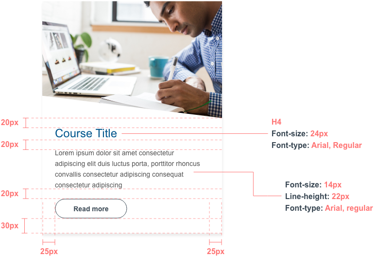
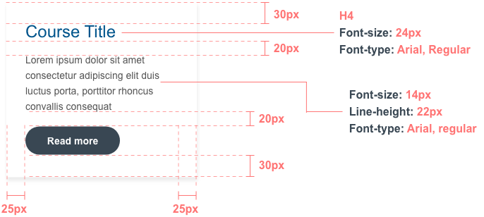
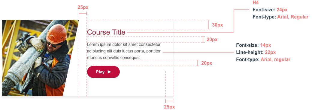
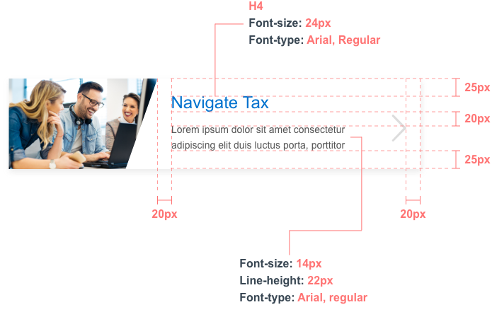
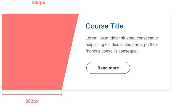
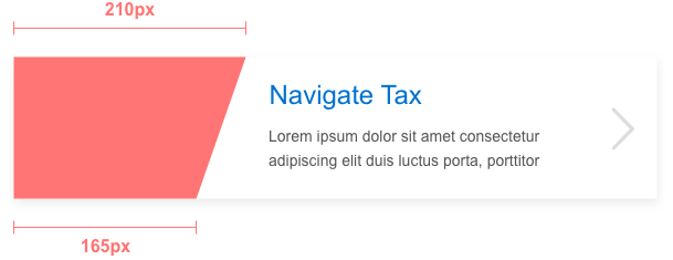
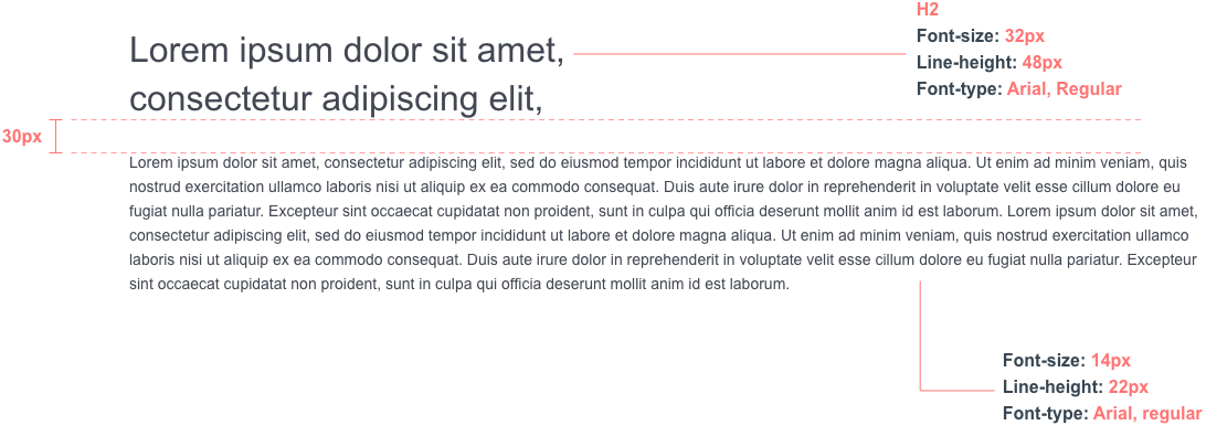
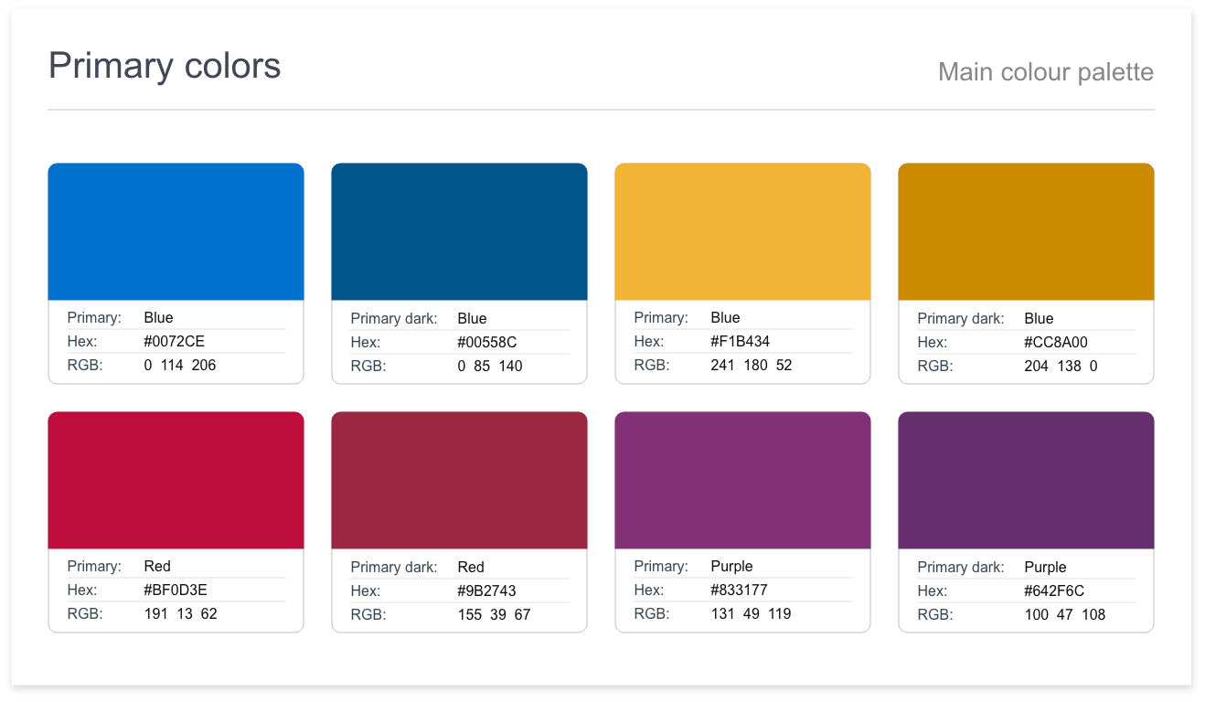
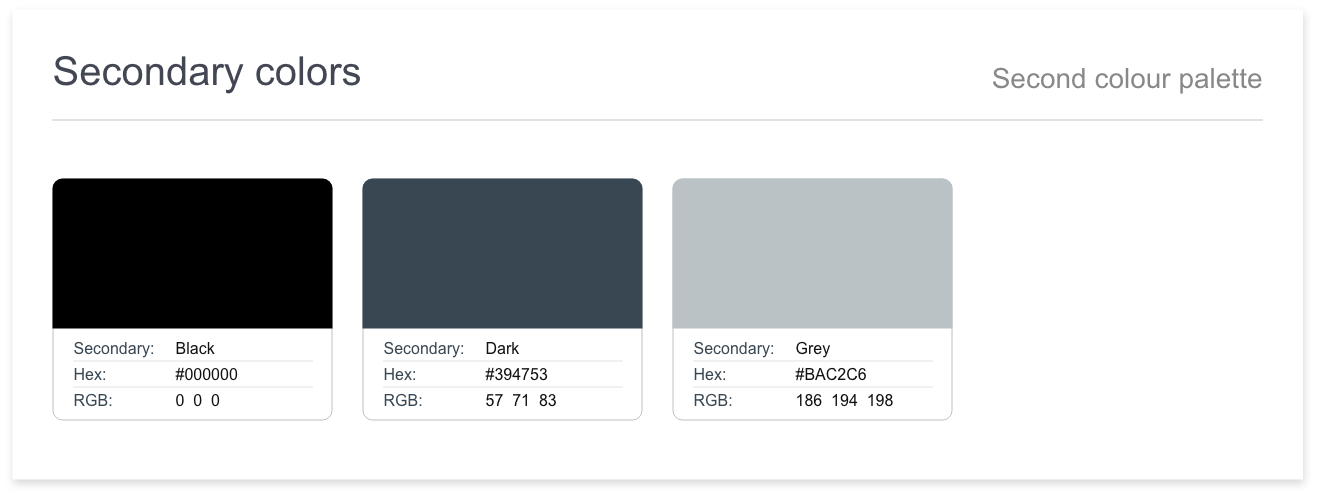
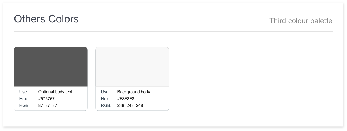
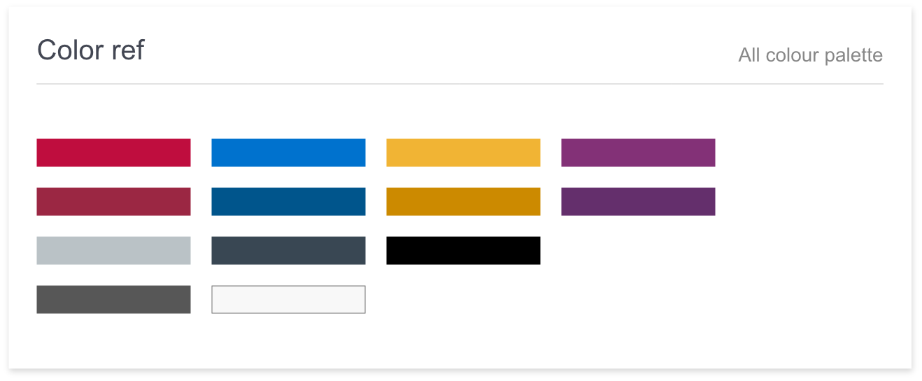
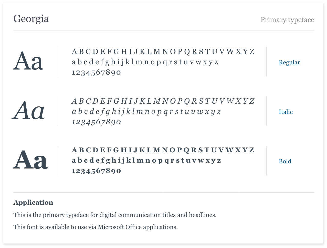
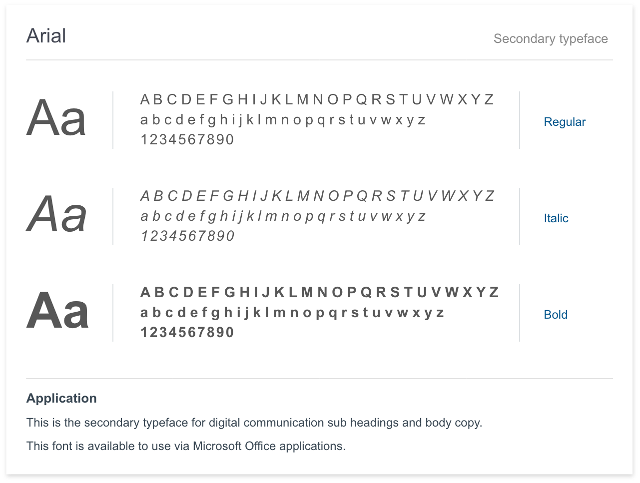
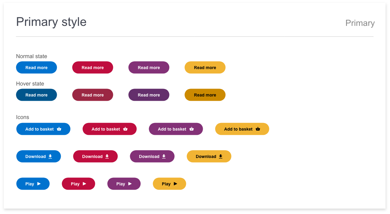
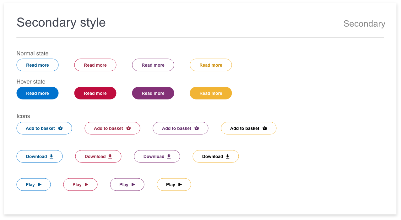
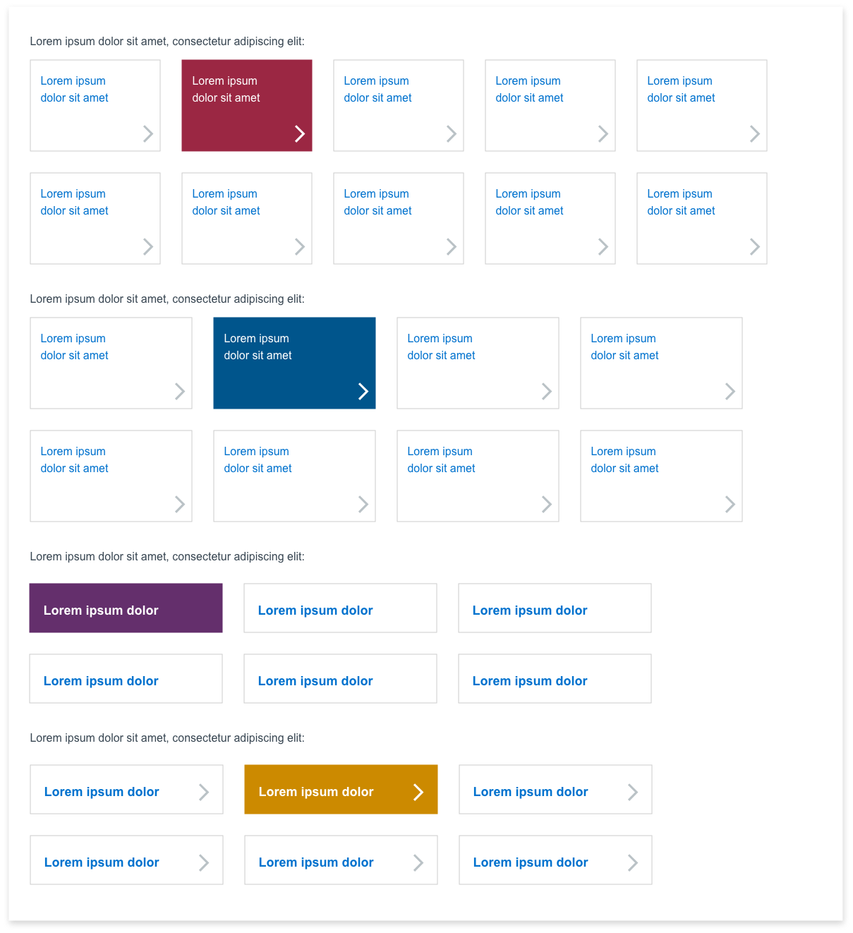
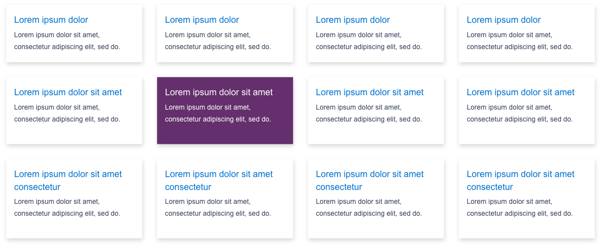
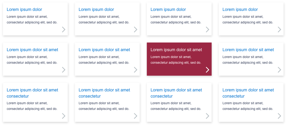
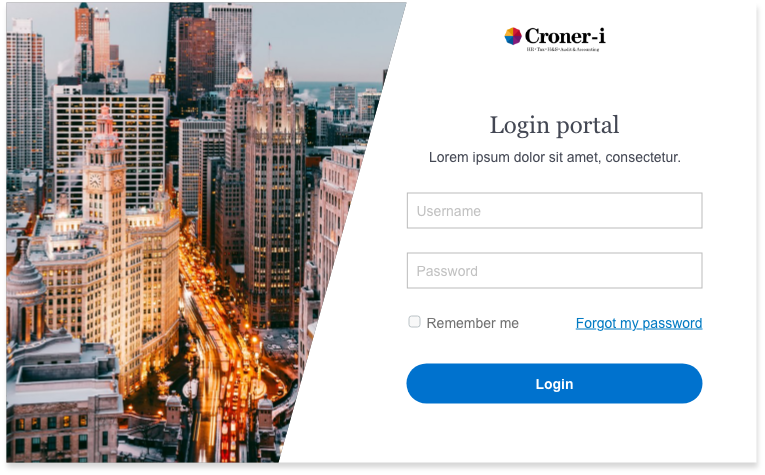
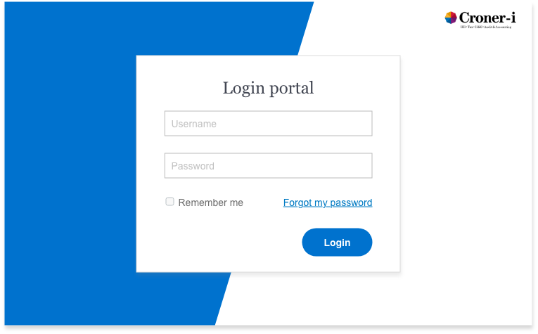
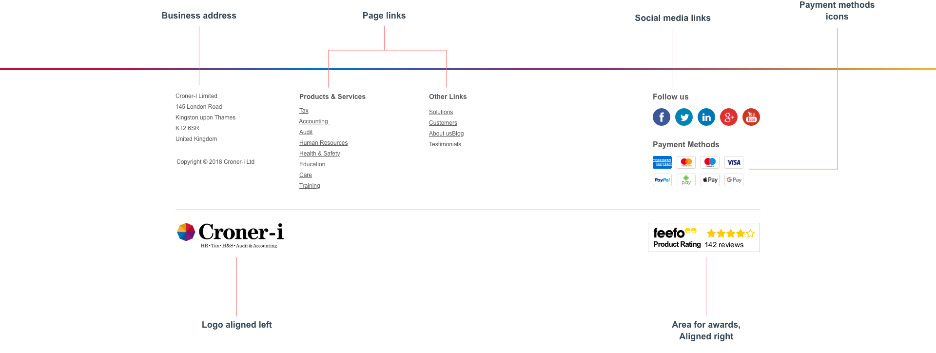
The online digital products lacked consistency plus designs and features needs improving along with the user experience flow. My vision is to create a new living digital product for the company: Design System. To create a consistent look and feel and to design a better experience for users. The design system will have reusable UI components which creates a quick, efficient work flow. I have been continually improving and updating the design system as ongoing.
Once a got the design system where I needed it to be, ready for use across all the digital products, I worked with developers so they can implement the UI component library based on my design system, I also educated the stake holders to get them on board in the early stages. We started to roll out the design system across all the digital products and as a result we have had positive feedback from clients and across the business. There was better branding consistency on the look and feel and better improvements for the user flow as we've tested this.
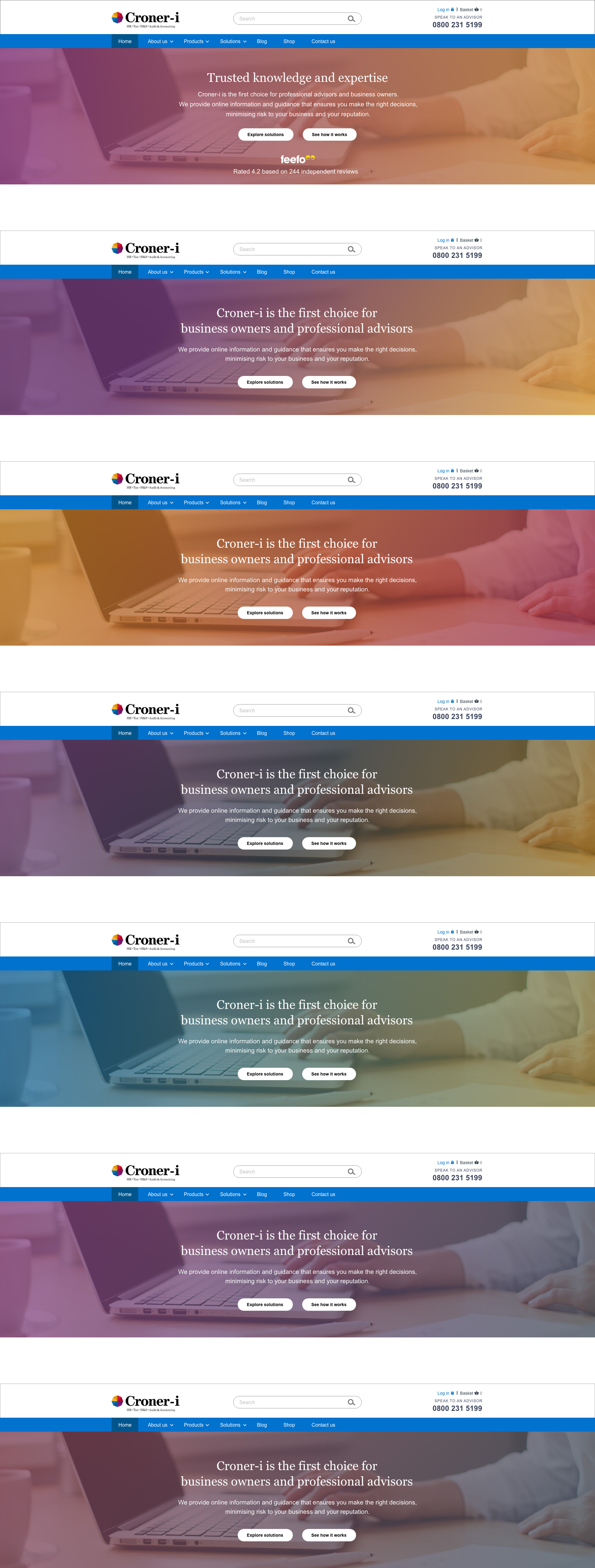
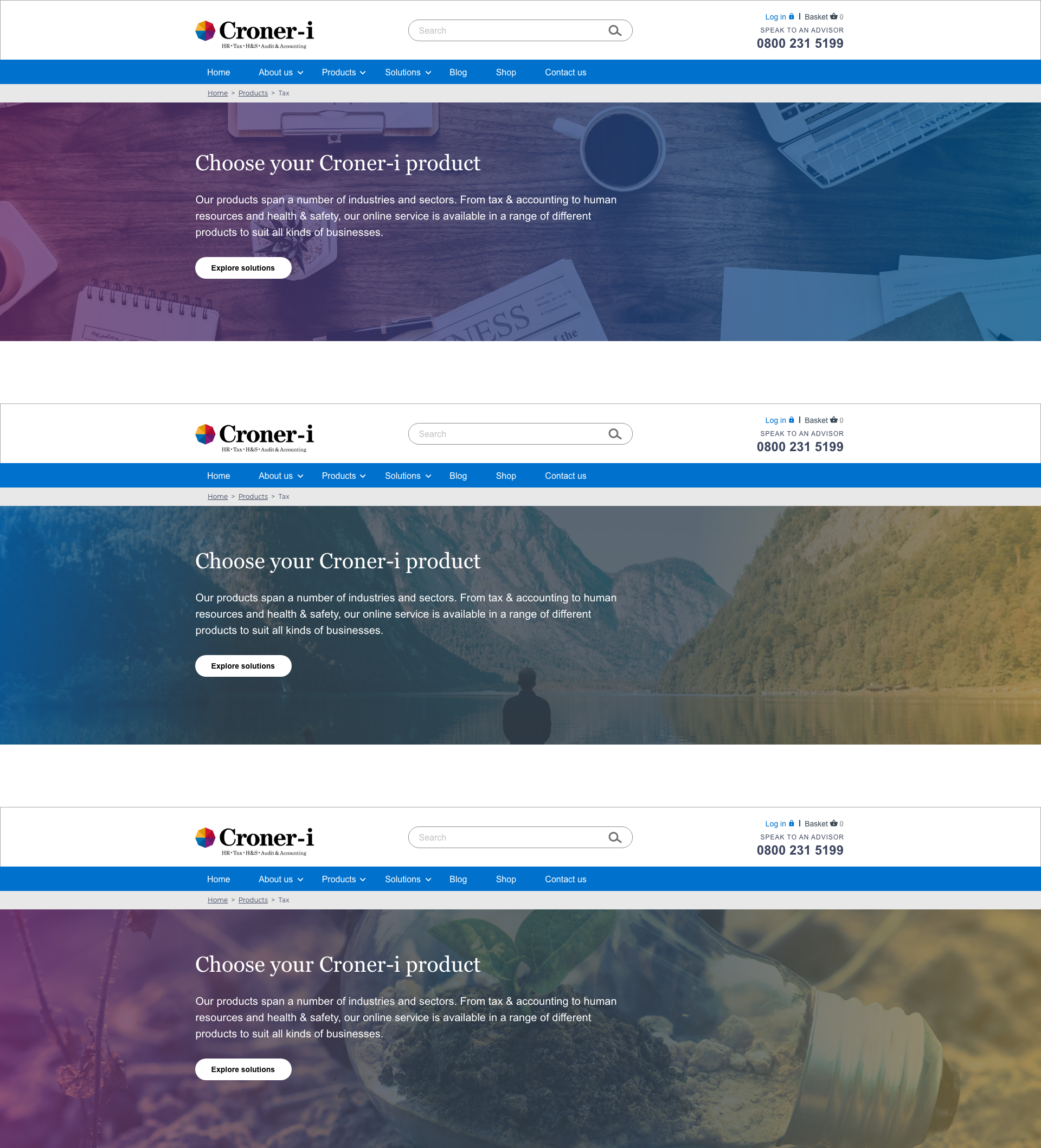
Normal header image

When you scroll down the page then the nav will disappear and the menu button will appear

Navigation dropdown

Menu with hero

When you start to scroll down the page blue menu bar will disappear whilst blue menu button will show

Menu on hero with dropdown

